

The fertilizer shortage hits different when you're looking at 2,400 acres of corn and soy with only enough product to properly treat maybe 1,600. That gap between what you need and what you can get? It's forcing operations into allocation decisions that most farms aren't equipped to handle well.
Most farms either spread everything thin across all fields (the peanut butter approach), or they fully fertilize their "best" fields and leave others short. Both strategies leave serious money on the table because they ignore how different fields respond to fertilizer at different application rates.
The real opportunity sits in understanding marginal response - how much extra yield you get from each additional pound of nitrogen or phosphorus on specific fields. A field that's already at 80% of optimal fertility might only give you 2 bushels per acre for another 20 pounds of nitrogen. Meanwhile, that neglected back forty sitting at 40% fertility could return 8 bushels for the same 20 pounds.
Most farms miss this because they're working with averages and gut feel instead of field-specific response data. They know Field A is "good" and Field B is "okay," but they don't know that Field A hits diminishing returns after 140 lbs/acre while Field B keeps responding linearly up to 180 lbs/acre.
The expensive education of uniform allocation
Three seasons back, a 3,200-acre corn operation outside Cedar Rapids learned this lesson the hard way. They had access to about 75% of their normal fertilizer supply and decided to reduce all fields proportionally. Every field got 75% of its typical application.
Some fields barely noticed the reduction - yields dropped maybe 3%. Others crashed by 18%. Total operation yielded 11% below normal, but their modeling later showed they could have limited the loss to around 4% with smarter allocation.
The uniform reduction ignored fundamental differences in how fields respond to inputs. Sandy fields with low organic matter respond dramatically to fertilizer changes. Heavy clay soils with good organic content show much more stability. Fields with consistent moisture access can utilize higher nitrogen rates efficiently. Drought-prone areas hit diminishing returns much faster.
Most of this response variation is predictable. Soil tests, yield history, and basic field characteristics can tell you roughly where each field's response curve sits.
Building your marginal response curves (without a PhD)
You don't need complex modeling software to map out basic response curves for your fields. Start with what you already know, then layer in some structured observation.
Take control of your farm’s productivity.
Feldsly helps you plan, track, and optimize every farming operation with precision.
- Centralized crop scheduling
- Resource & labor management
- Real-time weather alerts
No credit card required
Take your last three years of yield data and look for patterns. Which fields consistently outperform when conditions are good? More importantly, which fields maintain yields even in tough years? These resilient fields often have flatter response curves - they don't crash without maximum inputs.
Now add your soil test data. Organic matter percentage correlates strongly with nitrogen response curves. Fields under 2% organic matter typically show sharp, almost linear responses up to higher application rates. Fields over 4% organic matter flatten out much earlier - they're getting nitrogen from mineralization.
Simple scoring approach that works:
-
Historical yield stability (1 = highly variable, 5 = very consistent)
-
Organic matter (1 = under 2%, 5 = over 4%)
-
Water holding capacity (1 = very sandy, 5 = heavy clay)
-
Drainage quality (1 = poor, 5 = excellent)
-
Previous crop (1 = corn after corn, 5 = after alfalfa)
Fields scoring 20+ typically show gradual response curves - they maintain decent yields even with reduced fertilizer. Fields under 12 show steep response curves - they need inputs to perform.
Track actual yields against fertilizer rates for even just one season, and these patterns become obvious. That 40-acre field by the creek that scored 22? It yielded 178 bushels with 140 lbs N and 181 bushels with 180 lbs N. The hilltop field that scored 11? It dropped from 172 to 148 bushels with the same reduction.
The profitability weight most farms forget
Response curves tell you about yield, but yield alone doesn't pay bills. A bushel from your owned ground profits differently than a bushel from that expensive cash rent field.
Profitability weighting changes the allocation game entirely. That cash rent field at $380/acre needs every bushel just to break even. Your owned ground at $85/acre in taxes and maintenance? It's profitable at almost any yield level.
Consider two fields with identical response curves:
Field A: 80 acres owned outright, $85/acre fixed costs Field B: 80 acres cash rent, $380/acre
Both typically yield 185 bushels with full fertilizer. Both drop to 165 bushels at 75% fertilizer. The yield impact is identical, but the profit impact?
Field A at reduced fertilizer: Still nets roughly $420/acre Field B at reduced fertilizer: Drops to $180/acre
The cash rent field lost $240/acre in profit. The owned field lost $80/acre. Same yield loss, triple the profit impact.
High-cost acres need maximum yields to generate returns. Low-cost acres can absorb yield reductions and still contribute solid profits.
Your prioritization matrix template
Framework that actually works in practice. It's not perfect, but it beats gut-feel allocation by a wide margin.
Score each field on three dimensions:
Response Score (1-10 scale)
-
Historical yield response to fertilizer
-
Soil organic matter levels
-
Water availability and drainage
-
Previous crop nitrogen credits
Profitability Weight (1-10 scale)
-
Land cost per acre (rent or ownership costs)
-
Proximity to storage/delivery points
-
Harvest timing and logistics costs
-
Contract obligations or premiums
Risk Factor (1-10 scale)
-
Drought/flood probability
-
Pest pressure history
-
Weed management challenges
-
Equipment accessibility issues
Multiply Response Score by Profitability Weight, then divide by Risk Factor. This gives you a Priority Score.
| Calculation | Example |
|---|---|
| Multiply Response Score by Profitability Weight, then divide by Risk Factor. | Field A: Response 8 × Profitability 9 ÷ Risk 3 = Priority Score 24 |
| Field B: Response 6 × Profitability 4 ÷ Risk 2 = Priority Score 12 |
Rank all fields by Priority Score. Start allocating fertilizer to achieve optimal rates on highest-priority fields first. Work down the list until supplies run out.
Testing the matrix: 3 farms, 3 different shortage scenarios
Scenario 1: Large corn/soy operation, 4,800 acres, 70% fertilizer supply
This central Illinois operation had 42 fields ranging from 40 to 200 acres. Previous approach: uniform reduction across all fields. Result: 8% yield decrease, $284,000 lost profit.
Using the prioritization matrix, they identified 14 high-priority fields (mostly high-cost cash rent ground with strong response curves) that got full fertilizer. 18 medium-priority fields got 70-80% rates. 10 low-priority fields (owned ground with high organic matter) got 45-55% rates.
Result: 3% yield decrease, $97,000 lost profit. The matrix saved roughly $187,000 versus uniform allocation.
Scenario 2: Mixed grain operation, 1,600 acres, 60% fertilizer supply
Smaller operation, bigger shortage. They couldn't get close to optimal rates using uniform spreading. The matrix identified their contract production fields and best-responding ground for full treatment. Several poor-performing fields got minimal inputs.
The counter-intuitive result? Overall yields dropped 12%, but profits only fell 4%. They sacrificed yields on low-margin acres to protect high-margin production.
Scenario 3: Specialty corn producer, 800 acres, 85% supply
With only a 15% shortage, you'd think allocation wouldn't matter much. Wrong. This operation had several high-value seed corn contracts requiring specific quality metrics. The matrix prioritized these fields for full fertilization, taking modest reductions on commodity corn acres.
The difference: Meeting all contract specifications versus missing quality bonuses worth $45,000.
Critical adjustments nobody talks about
The basic matrix gets you started, but real operations need adjustments that textbooks skip.
Timing mismatches: Your highest-priority field might not need fertilizer until V6, while lower-priority fields need pre-plant applications. Don't hold product hoping for perfect allocation if it means missing application windows.
Equipment constraints: That back forty might score high on the matrix, but if it requires moving equipment across three townships during planting season, the logistics cost might override the priority score.
Weather gambling: Fields with narrow application windows due to wet conditions need different treatment. A field that scores 20 on the matrix but can only be accessed 5 days per year might get skipped entirely.
Contract reality: Sometimes a field with mediocre scores has an elevator contract attached. Missing contract specs triggers penalties that dwarf any fertilizer optimization gains.
These adjustments are operational realities that need to be layered on top of the raw scores.
Beyond spreadsheets: tracking and adjustment workflows
The matrix only works if you track results and adjust scores based on actual performance. Most farms build the matrix once then never update it.
Set up simple tracking:
-
Actual fertilizer applied per field
-
Actual yield achieved
-
Notes on weather, pest pressure, other factors
-
Calculated ROI per pound of fertilizer
After harvest, spend two hours reviewing which predictions hit and which missed. That field you thought had steep response curves but maintained yields with less fertilizer? Adjust its score down. The field that crashed harder than expected? Bump its response score up.
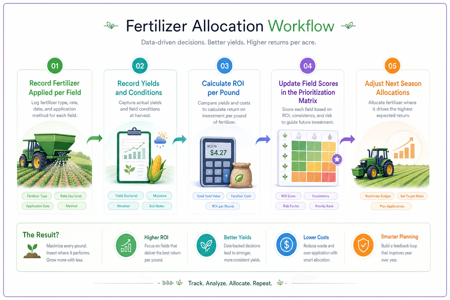
Below is a simple workflow visualization for tracking applications, recording yields, updating scores, and adjusting allocations next season.
Operations seeing real value from prioritization matrices treat them as living documents. They're constantly refining scores based on observed reality versus predictions. After three seasons, their matrices become surprisingly accurate predictors of field-specific fertilizer ROI.
When the matrix breaks down
This approach has limits. Some situations make prioritization matrices worthless or even harmful.
First-year operations: Without historical data, you're guessing at response curves. The matrix needs at least two seasons of field-specific observations to generate useful priorities.
Extreme weather years: Drought or flooding changes response dynamics completely. Fields that normally show strong fertilizer response might show zero response in drought. The matrix assumes relatively normal growing conditions.
Crop rotation transitions: Switching from continuous corn to a corn-soy rotation changes nitrogen dynamics dramatically. Previous response curves become irrelevant. You need new baseline data.
Precision agriculture overlap: If you're already doing variable-rate application with good prescription maps, the field-level matrix becomes redundant. You need sub-field prioritization instead.
The digital evolution of allocation
Smart farms are moving beyond paper matrices to digital tracking systems. The concept stays the same, but the execution gets far more sophisticated.
Modern operational software can pull yield monitor data, soil test results, and economic factors into automated prioritization scoring. Instead of manually calculating priority scores, the system updates continuously based on real performance data.
These platforms track fertilizer inventory levels and automatically suggest allocation adjustments as supplies change. When you're down to your last 20 tons of MAP, the system shows exactly which fields to skip versus treat to maximize whole-farm ROI.
The automation really shines in execution tracking. Instead of notebooks and spreadsheets, digital systems record exactly what got applied where, then correlate those applications with yield results. The response curve predictions get better every season because the system learns from accumulated data.
Some operations now run multiple allocation scenarios before ordering fertilizer. They model different shortage levels and see the economic impact before committing to purchases. When fertilizer prices spike, they know exactly how much they can reduce orders while staying profitable.
Making allocation decisions that actually stick
Building the matrix is easy. Getting your team to follow it during application season? That's where most farms fail.
The operator running the spreader at 10 PM doesn't care about your priority scores. They care about getting acres covered efficiently. If your matrix requires constant field-switching and complex rate changes, it won't survive contact with reality.
Simplify the execution:
-
Group similar-priority fields that are geographically close
-
Round rates to spreader-friendly numbers
-
Create simple field maps with three colors
full rate, reduced rate, minimal rate
-
Build in buffer zones so operators aren't constantly adjusting rates
Train your team on why certain fields get priority. When they understand that Field 23 pays the rent while Field 8 barely covers costs, they're more likely to follow the plan.
Track what actually happens versus what you planned. Every operation has that one operator who "knows better" and adjusts rates based on feel. Sometimes they're right. Sometimes they just cost you $20,000 in lost margins.
From shortage to strategy
Fertilizer shortages feel like crisis management, but they're really forcing farms to do what they should anyway - allocate inputs based on ROI rather than tradition.
The operations thriving despite shortages aren't the ones with special supplier relationships or bigger storage capacity. They're the ones who know exactly how each field responds to inputs and allocate accordingly.
Your prioritization matrix won't be perfect year one. Neither will year two. But by year three, you'll wonder how you ever allocated inputs without it. You'll find yourself using the same framework for seed selection, chemical applications, even equipment time allocation.
Start simple. Pick your ten most different fields and build response curves from what you already know. Apply the matrix to just those fields this season. Track the results ruthlessly. Next season, expand to twenty fields.
The goal isn't perfection. It's beating the "spread it evenly and hope" approach that most farms default to. With even basic prioritization, you can maintain 85-90% of profits while working with 70% of normal fertilizer supplies.
The shortage won't last forever. But the allocation discipline you build now will pay dividends long after supplies normalize.
Ready to revolutionize your farm management?
Join 500+ farms using Feldsly to boost yields, reduce waste, and streamline daily farm workflows.